
Interior paint colors popular today are warmer, calmer, and more connected to nature.
Cool grays and stark whites are losing ground as homeowners choose softer shades inspired by sand, stone, clay, foliage, wood, and warm natural finishes.
Current color trends favor comfort, balance, and livability rather than sharp contrast or overly polished minimalism.
Earthy mid-tone neutrals, gentle organic shades, and softer natural finishes are shaping rooms that feel relaxed, grounded, and easy to live in.
So, which paint colors best capture that shift right now?
Cream is a Softer Alternative to White
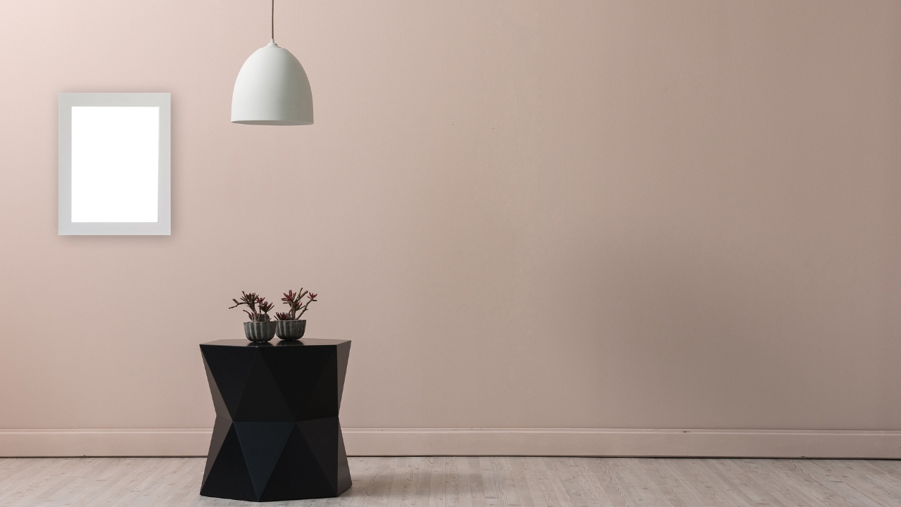
Cream is becoming a favorite alternative to bright white because it keeps rooms light without making them feel cold or sterile.
Instead of a sharp white wall that can look harsh in certain lighting, cream gives a room a warmer and more welcoming base.
Cream, beige, and greige are among the dominant warm neutral choices. Cream is especially useful when a room needs brightness, flexibility, and a softer mood.
Kitchens are one of the best places to use cream.
Cream, warm white, mushroom, and buttery yellow can brighten cabinetry, walls, and breakfast areas without creating a clinical look.
Cream also pairs well with stone counters, brass fixtures, warm wood shelving, kitchen Splashbacks, and natural tile.
Open-concept spaces benefit because cream can carry through several areas without feeling repetitive.
A cream wall color can connect the kitchen, dining area, and living room while allowing furniture, art, rugs, and lighting to bring in contrast.
Bedrooms also work well with cream because the color feels soft, quiet, and flexible.
Cream walls with khaki bedding, warm wood furniture, and muted green accents can create a calm, natural palette.
Trim and ceilings are another smart use for cream.
A soft cream trim can look warmer than stark white, especially next to these wall colors:
- Khaki
- Greige
- Taupe
- Mushroom
- Jade
Cream ceilings can also reduce harsh contrast in rooms with earthy wall colors.
That warmth can look especially good in vintage-inspired rooms, nurseries, cozy bedrooms, or spaces with traditional decor, although it may not be the best whole-home neutral for every interior.
Together, these pairings help cream feel calm, complete, and easy to decorate around. Khaki is one of the most important interior paint colors. Universal Khaki SW 6150 / HGSW6150 has become a major Color of the Year pick, helping khaki move into the spotlight as a warm, reliable neutral. Universal Khaki is an earthy mid-tone tan that sits between beige and taupe. Lighting has a major impact on how Universal Khaki appears in a room: Sample testing matters with khaki because undertones can shift depending on the wall, room exposure, flooring, and nearby finishes. Khaki offers more depth than beige, but it still works as a neutral. It can cover large spaces without feeling too dark, and it has enough color to make walls feel intentional. For homeowners tired of plain white or cool gray, khaki is a practical way to add warmth without choosing a bold wall color. Bedrooms also work well with khaki because the color feels calm and restful. Cream bedding, natural linen, walnut furniture, and soft lighting can help create a comfortable retreat. Hallways and open-concept areas benefit as well. Khaki can connect multiple rooms while still feeling warmer than a basic off-white. In spaces where one color needs to work with different furniture, flooring, and light conditions, soft khaki can act as a transitional neutral. Cream keeps khaki soft and clean, while darker accents create a more layered look. Jade green is one of the strongest statement colors. It feels moodier than sage, but it still has a calm, natural quality that works well indoors. For homeowners who want more color without going too bright, jade offers a grounded option. Hidden Gem N430-6A is one of the major 2026 Color of the Year picks. Its smoky jade tone combines blue-green depth with gray undertones, creating a color that feels bold without overpowering a room. Jade can change significantly depending on the light. In north-facing rooms, jade shades with gray undertones can look moodier and more subdued. In south-facing rooms, stronger natural light can bring out more green, making the color feel livelier and more saturated. Bathrooms are one of the best places to use jade. A smoky jade wall color can add spa-like calm, especially with cream trim, marble, stone, warm beige tile, brass fixtures, and natural wood vanities. Bedrooms can also handle jade well, especially when the goal is a cozy and restful mood. Jade walls with cream bedding, khaki accents, and warm wood furniture can feel relaxed without looking plain. Kitchen cabinets are a practical way to bring jade into the home. Cream, greige, taupe, or warm white walls can soften jade cabinetry and keep the room balanced. Powder rooms and accent walls are safe places to use jade for a bolder effect. Smaller rooms can handle stronger colors because they are separate, contained spaces. A jade powder room with brass hardware, stone counters, and warm lighting can feel polished and memorable. Best pairings for jade include cream walls or trim, natural wood, brass hardware, khaki, taupe, stone, marble, warm beige, and greige. Cream keeps jade crisp but not cold. Khaki and taupe bring warmth, while wood and stone connect the color to natural materials. Colors inspired by natural materials are becoming more popular because they make interiors feel grounded without making rooms feel heavy. Instead of crisp and cold palettes, interiors lean toward comfort, warmth, and natural texture. Warmer paint colors can make a room feel calmer, more relaxed, and more connected to the materials already used in the home. Warm neutrals such as cream, beige, and greige are especially popular because they adapt well to changing natural light. Morning light, afternoon sun, and evening shadows can all shift how a paint color looks, so flexible neutrals are useful in busy homes and open layouts. Organic materials also work especially well with the current paint trends. Earthy color palettes also allow bolder choices without making a home feel too trendy. Terracotta, rust, olive, cordovan, plum, and darker brown can feel polished rather than overpowering when balanced with cream, khaki, greige, or taupe. Popular interior paint colors in 2026 are warm, natural, and easy to live with. Khaki, cream, jade, and warm neutrals all support interiors that feel grounded, comfortable, and connected to natural materials. Red brick accents also pair naturally with khaki and warm neutrals, especially in interiors that use wood, stone, and matte black details. Khaki is one of the year’s leading neutral choices, with Universal Khaki SW 6150 / HGSW6150 showing how important earthy mid-tone neutrals have become. It adds warmth and depth while staying flexible enough for living rooms, bedrooms, hallways, offices, kitchens, and open-concept spaces.
Khaki is a New Go-To Neutral
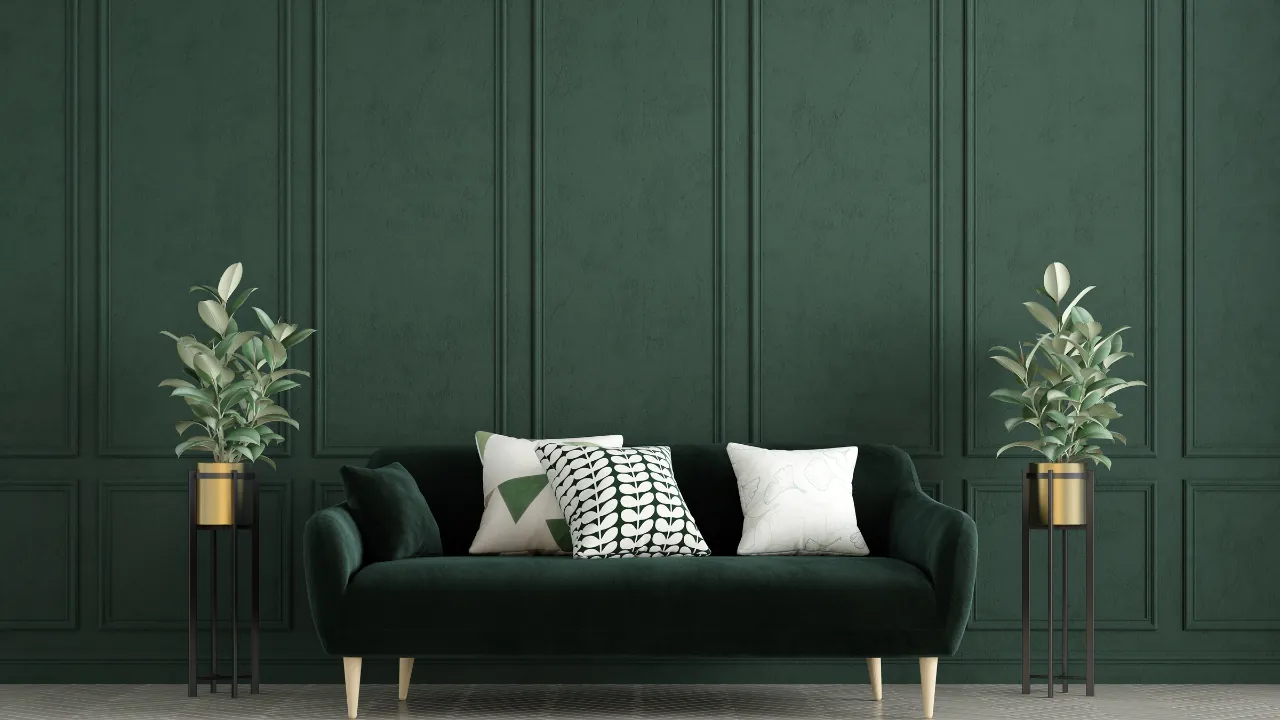
Jade is a Nature-Inspired Statement Color
Why Warm, Earthy Paint Colors Are Currently Trending
Many homeowners are leaving cool gray and bright white behind. Warmer neutrals, nature-inspired greens, and earthy tones now feel more personal, softer, and easier to live with every day.
Summary


